Site with login
Every check passed: waitlist, gated case studies and a private signup list.
- Result: Pass
- Checks: 8 of 8 pass
- Prompts: 4; every check passed after prompt 4
- Time: 5m1s in total
- Spent: $0.78
Checks
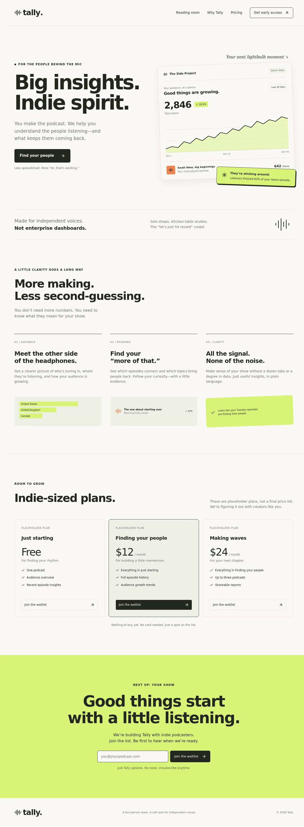
- Pass: The site shows what the product does and a pricing section · Signed out, read the podcast-analytics explanation and clicked Pricing: Free, $12/month and $24/month, marked as placeholder plans.
- Pass: Joining the waitlist with an email shows a confirmation · Signed out, entered an email in Join the waitlist and saw 'You’re on the list! We’ll email you when Tally is ready.'
- Pass: Joining twice with the same email does not create a second entry · Entered the same email again after a reload and saw 'You’re already on the list. Your spot is safe!'
- Pass: A signed-out visitor who opens a case study gets a sign-up or sign-in wall · Signed out, clicked a case study and saw only a preview with a sign-up or sign-in wall; opening the full article went to sign-in.
- Pass: A signed-in reader opens and reads a full case study · Signed in, opened the case study and read all four sections with no wall.
- Pass: A signed-in reader who is not an admin cannot open the waitlist page · Signed in as a non-admin, opened the waitlist page and got a No access page with no emails.
- Pass: The admin sees the waitlist with the most recent signup in it · Joined with a new email; the admin's waitlist showed it first, marked Latest, after a reload.
- Pass: An email that just joined the waitlist appears once in the admin's waitlist · Joined twice with one email; the admin's waitlist showed it as one row (2 signups in total).
Run
- Run: 11 Nov 2026 · vibe prompts
- Builder: the Framer 4 agent on GPT 6.1 Sol, in a new project
- Customer: an AI agent playing the owner of Tally, writing in the Brief style
- Agent steps: 30 tool steps
- Prompt limit: 40 per app
- Cost: $0.70 for the builder, $0.09 for the judge
- Judge: an AI agent that tried each check in the live preview with a browser, signed in with each test account
Site with login
Every check passed: waitlist, gated case studies and a private signup list.
- Result: Pass
- Checks: 8 of 8 pass
- Prompts: 4; every check passed after prompt 4
- Time: 5m1s in total
- Spent: $0.78
Prompt 1 of 4
We’re Tally, a four-person startup making analytics for indie podcasters. I’d like a marketing site that clearly explains what we do, shows pricing, and lets people join our waitlist with their email. Our audience is creators, not big companies, so make it confident and a little playful—think Linear meets early Notion, rather than a corporate SaaS template. Please write approachable copy about helping podcasters understand their audience and see what’s working. For pricing, use clearly labeled placeholder plans for now. When someone joins the waitlist, show a clear confirmation. If they enter the same email again, let them know they’re already on the list rather than adding them twice.
Built Tally’s site with approachable copy, a playful analytics preview, and
- Pass: The site shows what the product does and a pricing section · Signed out, read the podcast-analytics explanation and clicked Pricing: Free, $12/month and $24/month, marked as placeholder plans.
- Pass: Joining the waitlist with an email shows a confirmation · Signed out, entered an email in Join the waitlist and saw 'You’re on the list! We’ll email you when Tally is ready.'
- Pass: Joining twice with the same email does not create a second entry · Entered the same email again after a reload and saw 'You’re already on the list. Your spot is safe!'
Prompt 2 of 4
Next, I’d like a public reading section with case studies and a whitepaper. Anyone should be able to browse the titles and short previews, but opening a piece should ask them to sign up with their email or sign in before they can read the full thing. We want to know who’s reading, not just give everyone an anonymous download. Once someone is signed in, let them open and read the full case studies and whitepaper without hitting that wall again. Keep the signup experience friendly and in the same Tally style as the rest of the site.
Added the Reading room with public previews and email signup/sign-in
- Pass: A signed-out visitor who opens a case study gets a sign-up or sign-in wall · Signed out, clicked a case study and saw only a preview with a sign-up or sign-in wall; opening the full article went to sign-in.
- Pass: A signed-in reader opens and reads a full case study · Signed in, opened the case study and read all four sections with no wall.
Prompt 3 of 4
I’d like a private admin page where I can see everyone who’s joined Tally’s waitlist, including the latest signup. Keep this just for me as the company admin—someone signed in to read our case studies or whitepaper shouldn’t be able to open the waitlist page or see anyone’s email, even if they have the link.
Added the private Waitlist admin page, showing all signups
Prompt 4 of 4
I’m using admin@example.com for my admin account. The waitlist still isn’t working: I tried joining from the homepage with latest.reader.271@example.com twice, and both times got “Couldn’t join right now.” When I opened and refreshed the admin waitlist, it still showed 0 signups and “No signups yet.” Please fix joining the waitlist so successful signups actually appear for me, with the newest first. Repeat emails should get the friendly already-on-the-list message. Keep this page and everyone’s email addresses private to the admin—regular signed-in readers shouldn’t be able to access them, even with the direct link.
Fixed homepage signups.
- Pass: A signed-in reader who is not an admin cannot open the waitlist page · Signed in as a non-admin, opened the waitlist page and got a No access page with no emails.
- Pass: The admin sees the waitlist with the most recent signup in it · Joined with a new email; the admin's waitlist showed it first, marked Latest, after a reload.
- Pass: An email that just joined the waitlist appears once in the admin's waitlist · Joined twice with one email; the admin's waitlist showed it as one row (2 signups in total).
Site with login
Every check passed: waitlist, gated case studies and a private signup list.
- Result: Pass
- Checks: 8 of 8 pass
- Prompts: 4; every check passed after prompt 4
- Time: 5m1s in total
- Spent: $0.78
Company site with waitlist and gated content
Test accounts:
- Member: member@example.com
- New reader: member.2@example.com
- Admin: admin@example.com
This is the marketing site of Tally, a four-person startup making analytics for indie podcasters. Tally is not launched yet. The site explains what Tally does, shows its planned pricing, and lets anyone join the waitlist with their email. It also has a reading library of case studies and a whitepaper: anyone can browse the titles and previews, but reading the full pieces needs a free reader account, because the team wants to know who is reading. The founder, as the admin, sees everyone on the waitlist and every reader, and publishes new pieces.
The app has three roles.
- Visitors: read the marketing pages, see pricing, join the waitlist and browse the library's previews. They never need an account for any of this.
- Readers: sign up or sign in with the app's sign-in, tell Tally a little about their show, and read the full case studies and the whitepaper, including downloading the whitepaper as a PDF.
- The admin: (the app's admin account) sees the waitlist and the readers, and adds and edits library pieces. Nobody else can open the admin area.
On first open, Tally holds its full marketing site, a library of 4 case studies and 1 whitepaper, 36 people on the waitlist and 14 readers with real reading history; member@example.com is a reader who has already read one case study, and member.2@example.com has never signed up.
Nothing is broken and everything works. Every button, link and form does what it says with real data. No page shows placeholder text, sample images, "coming soon", "not set up yet", lorem ipsum or a link to nowhere. Pricing shows Tally's real planned plans, not placeholder plans, and every email really arrives in the recipient's inbox.
These are not part of Tally's site: the analytics product itself, payments or subscriptions, connecting a podcast feed, a blog with comments, a newsletter tool beyond the waitlist confirmation, sending invites or other emails to the waitlist from the admin area, library filters, per-piece reading statistics, a referral programme or waitlist positions you can move up, live chat, and team accounts for readers.
Brand and visual direction
Tally's audience is indie podcasters: people who make a show on their own or with one or two friends, often alongside a day job, with anywhere from 500 to 50,000 listeners an episode. They are creators, not marketing departments. They are tired of hosting dashboards that show downloads and nothing else, and allergic to enterprise software. They want to feel that Tally was made by people like them: sharp, a little funny, and serious about the numbers.
Name and voice: The product is called Tally, with the line "Know who's listening." The voice is confident and a little playful, like a smart friend who happens to know data: short sentences, plain words, the occasional dry joke, and always specific ("See the minute people skip, not just the download count"). Buttons say what happens: "Join the waitlist", "Read the case study", "Sign up to read", "Download the PDF". There are no exclamation marks in buttons, no emoji, and none of the corporate words: never "leverage", "synergy", "enterprise-grade", "solutions", "supercharge", "unleash" or "data-driven insights".
Visual direction: Tally looks like Linear's precision met Notion's early warmth: clean, confident layouts with crisp interface details, softened by a warm paper colour, a characterful serif and one bright accent.
- Colour: a warm paper white page (about #FBF8F3), white panels (#FFFFFF), a deep ink for text (about #17171C), warm grey for secondary text (about #6E6A64) and hairline borders (about #E8E3DA). There is one accent, a bright podcast pink (about #E5487A), used only for the main action on a screen, highlighted numbers in charts and focus rings. Charts otherwise use ink and warm greys. There are no gradients, glows, glass effects or purple-blue palettes.
- Type: Fraunces for headings, set large with a little of its soft, quirky character, and Manrope for interface and body text. Body text is 17 px on marketing pages and 18 px in the reading view. Numbers in charts, prices and the admin tables use tabular figures.
- Shape: 10 px corners on panels and buttons, 1 px borders, and no drop shadows except a soft one under the product screens. Small, rounded tags for show genres.
- Layout: a 12-column grid with a maximum width of about 1160 px, and a reading column of about 680 px. Pricing shows three plans side by side on desktop, scrolls as a row on tablet and stacks on phone. The library grid has 3 columns on desktop, 2 on tablet and 1 on phone. The header is slim and sticky, with the Tally wordmark, Product, Pricing, Library, About, Sign in and "Join the waitlist".
- Imagery: crisp renderings of Tally's real planned screens, built in the page as real interface (a listener retention curve, episode drop-off minute, where listeners come from), using a named example show, "Small Hours" (a fictional sleep-science podcast), labelled as an example. The team's four real photos on the About page, and each case study's show artwork. There are no stock photos, microphones on gradients, 3D shapes, AI illustrations or decorative icon sets.
- Motion: short (150 to 200 ms) fades and hovers, and the example retention curve drawing once when it first scrolls into view. Nothing bounces or loops.
- Every page works at 390 px wide with no horizontal scrolling, and every control works by keyboard with a visible pink focus ring.
Pages beyond the product: The footer links to real pages with real content: About (the four people, why they built Tally, where they work from), Library, Pricing, Privacy (what the waitlist and reader accounts store and why, and how to be removed), Terms, and a contact email. A branded not-found page shows a flat retention curve and "Nobody's listening at this address", with links to the home page and the library.
Checks:
- Every page shows the Tally wordmark and the same header and footer, and every footer link opens a page with real content, not a placeholder
- The design follows the direction above: warm paper background, deep ink text, one pink accent for main actions and highlighted numbers, Fraunces headings with Manrope text, soft corners and hairline borders, and no gradients or stock imagery
- The home page, pricing, the library and a case study have no horizontal scrolling at phone width, and their main actions stay reachable
- Opening a made-up address shows the branded not-found page with links back
Content: what Tally starts with
On first open, the site holds real content in Tally's voice, so every page and admin screen is meaningful.
Pricing: Three planned plans, stated in US dollars per month and marked "Planned pricing for launch; waitlist members get 3 months of Creator free": Free (1 show, 90 days of history, downloads and listener locations), Creator at $12 a month (3 shows, full history, episode drop-off minute, listener retention, where listeners come from) and Studio at $29 a month (10 shows, team seats for 3, exports and a weekly email report). A comparison table lists every feature by plan.
Library: Four case studies and one whitepaper, each with a title, show name, show artwork, a two-sentence preview, reading time, tags and a full text of 1,200 to 2,500 words with headings, pull quotes and at least one chart:
- "How Small Hours found the minute listeners fall asleep", a sleep-science show with 18,000 listeners an episode.
- "Two friends, one football podcast, and the intro that cost them 30% of listeners", Second Ball.
- "From 600 to 6,000: what a local history show learned from where its listeners come from", Underneath Glasgow.
- "Cutting a weekly show to fortnightly without losing anyone", Kitchen Table Science.
- Whitepaper: "The State of Indie Podcast Listening 2026", 22 pages, based on Tally's survey of 412 indie podcasters, readable on the page and as a downloadable PDF.
Waitlist: 36 people who joined over the last eight weeks, each with an email, the date and time they joined, how they heard of Tally (from a short optional list), and their show's name when given.
Readers: 14 reader accounts with name, email, show name and size, and which pieces they opened and when. member@example.com is a reader who has read the Small Hours case study.
Checks:
- Pricing shows Free, Creator at $12 and Studio at $29 with their features and the planned-pricing note, not placeholder plans
- The library shows four case studies and one whitepaper with artwork, previews and reading times, and a sampled full case study reads as a real piece with a chart, not filler
- The admin's waitlist shows 36 people, newest first
- The admin's readers list shows 14 readers, including member@example.com with the Small Hours case study in their reading history
Visitor: the marketing pages
Home: A large Fraunces headline ("Know who's listening."), one sentence on what Tally does for indie podcasters, the waitlist form (one email field and "Join the waitlist") and a line showing the real number of people already on the waitlist ("Join 36 podcasters on the waitlist"). Below come three short sections, each with a crisp rendering of the real planned screen for the example show Small Hours: the minute people stop listening, who keeps coming back, and where listeners come from. A row of the latest two case studies links to the library. The home page ends with the waitlist form again.
Product: A longer page with each planned feature, what question it answers for a podcaster ("Is my intro too long?"), and its screen. It says plainly which hosts Tally will work with at launch (any show with a public RSS feed).
Pricing: The three plans, the comparison table and five questions that open and close (When do you launch? Will the price change? What counts as a show? Can I cancel? Is there a discount for waitlist members?).
About: The four founders with real names, roles, photos and one line each, and a short story of why they built Tally.
Checks:
- A signed-out visitor reads the home page, the product page and pricing, with the three planned plans and the comparison table
- The waitlist count on the home page matches the number of people on the admin's waitlist
- The pricing questions open and close with a mouse and the keyboard
Visitor: joining the waitlist
The waitlist form appears on the home page, the product page, pricing and at the end of every case study preview. It asks for an email, and after joining offers two optional questions: the show's name and how they heard of Tally.
Joining: A valid email shows a clear confirmation in place: "You're on the list. We'll email you when Tally is ready for you." It also shows the optional questions with a Save button; saving them updates the person's waitlist entry. The published app sends an email from its own address (hello@<project>.apps.framer.email) with the subject "You're on the Tally waitlist", a short friendly note from the team, what happens next, the waitlist offer of 3 months of Creator free, and a link to the library.
Duplicates: Entering an email that is already on the list, in any letter case and with spaces around it, never creates a second entry and sends no second email. It shows "You're already on the list. Your spot is safe."
Validation and errors: An empty or malformed email is refused next to the field ("That doesn't look like an email address"). If saving fails, the form says "Couldn't add you just now. Try again." with the email kept, and nothing is half-saved.
Checks:
- A signed-out visitor joins the waitlist with a new email and sees the confirmation, and the email appears in the admin's waitlist after a reload
- Joining again with the same email in capitals shows "You're already on the list" and the admin's waitlist still shows it once
- The "You're on the Tally waitlist" email arrives in the inbox of the address that joined
- A malformed email is refused with a message next to the field and nothing is added
- The show name saved after joining appears with that entry in the admin's waitlist
Visitor and reader: the library
Browsing: The library page lists every published piece as a card with artwork, title, show name, the preview, reading time and tags, the whitepaper marked as such.
The wall: Each piece has its own readable address, such as /library/small-hours. A signed-out visitor who opens it, from the library or by typing the address, sees the title, show, artwork, preview and the first two paragraphs, then a friendly wall: "Read the rest with a free reader account. We'll ask two quick questions about your show, that's it." with "Sign up to read" and "I already have an account". None of the rest of the text, the charts or the PDF can be reached signed out, including by the PDF's address.
Signing up: Signing up uses the app's sign-in. A new reader is asked their name, their show's name (optional) and the show's size (from a short list: under 1,000, 1,000 to 10,000, over 10,000 listeners an episode), and can tick to also join the waitlist. They then land back on the piece they were trying to read, now fully open. The published app sends a short email with the subject "Your Tally reading list", with links to every piece in the library.
Reading: A signed-in reader reads every piece in full, with its headings, quotes and charts, in a comfortable reading column, with the reading time and a "More from the library" row at the end. The whitepaper also has "Download the PDF", which downloads the 22-page PDF. A reader never meets the wall again, after reloading or signing back in. Every opened piece and every PDF download is recorded for the admin.
Checks:
- A signed-out visitor opens a case study from the library and sees only the preview and the wall, with no full text
- A signed-out visitor who types the whitepaper's PDF address gets the sign-in wall, not the file
- member.2@example.com, signing in for the first time from the wall, answers the questions and lands back on the same case study, now fully readable
- member@example.com, signed in, reads a full case study and downloads the whitepaper PDF without meeting the wall
Admin: waitlist and readers
The admin area is open only to the admin account. A reader or a signed-out visitor who opens any admin address, including by typing it, sees a plain "No access" page with no names, emails or counts.
Waitlist: Every person on the waitlist, newest first, with email, joined date and time, show name, and how they heard. The newest entry is marked "Latest". Totals at the top give the number of people on the list and how many joined this week. A search finds people by email or show name. "Export CSV" downloads the list as it is searched. The admin can remove an entry after confirming.
Readers: Every reader with name, email, show name and size, sign-up date, whether they also joined the waitlist, and the pieces they read and PDFs they downloaded, newest first.
Checks:
- member@example.com cannot open the waitlist or readers pages, even by typing their addresses, and sees no emails
- The admin sees the waitlist with the most recent signup first, marked Latest
- Searching the waitlist by a show name finds that entry, and Export CSV downloads the matching rows
- After member@example.com reads a second case study, the admin's readers list shows it in their reading history
Admin: library pieces
Editing: The admin adds and edits library pieces in one form: type (case study or whitepaper), title (required, up to 100 characters), show name, artwork (JPG, PNG or WebP up to 5 MB), the two-sentence preview (required), tags, and the full text with headings, bold, links, lists, quotes and images. A whitepaper also takes a PDF file up to 25 MB. The form offers a sample artwork image and a short sample PDF to download, so the form can be tried end to end. Errors appear next to the field in plain words, and nothing typed is lost.
Publishing: A piece can be saved as a draft, visible only to the admin, or published, when it appears first in the library behind the same wall. The admin can unpublish or delete a piece after confirming.
Checks:
- The admin adds a case study with artwork and publishes it; a signed-out visitor sees it first in the library with its preview and the wall, and member@example.com can read it in full
- A draft piece is not visible in the library or by address to a visitor or reader
- Publishing without a preview is refused with a message next to the field
Speed and findability
The site loads like a well-made marketing site. Every page's text, headline and first screen appear as soon as the page loads, without waiting for scripts. The product renderings are built in the page, not heavy images. Artwork and photos are resized copies, load lazily below the fold and keep their space reserved, so nothing jumps.
Every public page has its own title and description, for example "Pricing | Tally" and "How Small Hours found the minute listeners fall asleep | Tally". Each library piece has its artwork as the share image, and search engines see its title and preview but not the full text behind the wall. Pasting a case study's link into a chat app shows its title and artwork. The sitemap lists the marketing pages and published pieces; drafts and admin addresses are left out and are not shown to search engines.
Checks:
- The home page shows its headline and waitlist form within about 2 seconds, and scrolling does not shift the layout
- A case study has its own title, description and share image, and its full text is not in the page for a signed-out visitor
- The sitemap lists the marketing pages and published library pieces, and no drafts or admin addresses
Everything works
These checks apply to every screen above, for visitors, readers and the admin. The number before each check is its weight: 3 means the app fails if the check fails, 2 a serious defect, 1 a defect worth noting.
For every app:
- Must pass: Every feature this spec describes is there, and each fix the agent claims holds when the original steps are repeated
- Serious: At phone (390 px), tablet (810 px) and desktop (1,200 px and up), the home page, product, pricing, the library, a case study, the whitepaper, sign-up and the admin's waitlist, readers and piece form show nothing cut off, no sideways scrolling, a reachable header and menu, and inputs of at least 16 px
- Serious: Every header and footer link, library card, "More from the library" link and "Sign up to read" goes to the right page; reloading a case study, the whitepaper or an admin page on the live address works; a made-up address shows the "Nobody's listening at this address" page; Back returns to where the visitor was
- Minor: Show artwork, team photos, chart images and piece images load at the right shape without stretching, and pasting a case study's live link into a chat app shows its title and artwork, not a builder default
- Serious: Later work did not break earlier work: after the wall, reader accounts and admin screens are built, the marketing pages, pricing, the waitlist form and the starting library, waitlist and readers are still there and unchanged
- Minor: After each prompt, the agent's reply says honestly what changed and what it could not verify (including anything that still needs a key or account), is never empty, never presents preview-only as done, and never claims a fix that is not there in the live app
For this app:
- Must pass: Every flow works end to end with fresh input, checked where it lands: a new waitlist email and its show name appear in the admin's waitlist and raise the home page count; a new reader's sign-up and every piece they open or PDF they download appear in the admin's readers list; a piece the admin publishes appears first in the library behind the wall
- Must pass: Waitlist entries, the optional answers, removed entries, reader profiles, reading history, and pieces added, edited, drafted, unpublished or deleted stay as saved after a reload and in another browser, for the people who should see them
- Must pass: A signed-out visitor sees only the preview and the wall on every piece, and cannot reach the full text, charts or the whitepaper PDF by any address; readers reach every published piece but not drafts or any admin page; only the admin opens the waitlist, readers and piece form, and others see "No access" with no names, emails or counts
- Must pass: On the published address, member.2@example.com signs up from the wall, confirms by email, signs in, reloads, signs out and resets their password, and every link and redirect, including the return to the piece they were reading, lands on the live domain
- Serious: The "You're on the Tally waitlist" email and the "Your Tally reading list" email each arrive in a real inbox from hello@<project>.apps.framer.email, not in spam, with the waitlist offer and working links to the library and every piece
- Serious: The published app behaves like the preview: the waitlist, the wall, sign-up, reading, the PDF download, the emails and the admin screens work there, and no live page mentions "preview"
- Serious: Empty states (a waitlist search with no matches, a reader with nothing read yet), loading states and errors such as "Couldn't add you just now. Try again." are clear and in plain words, with no technical or setup text
- Serious: The piece form accepts artwork in JPG, PNG and WebP up to 5 MB and a whitepaper PDF up to 25 MB and refuses other types and larger files with a clear message; the whitepaper's "Download the PDF" and the waitlist's Export CSV each download a file that opens
- Serious: As a signed-out visitor, the page source and network requests contain no secret keys, no full text behind the wall, no drafts and no waitlist or reader emails; the waitlist form and sign-up link to the Privacy page
- Minor: The waitlist form, sign-up questions and piece form refuse empty and malformed input with a message next to the field; joining twice, in any letter case or with spaces, creates one entry and one email, and publishing twice creates one piece
- Minor: Searching the admin's waitlist finds a known email and a partial show name, shows a clear empty result for a word that matches nothing, and Export CSV downloads exactly the matching rows
Done when
Checks:
- A signed-out visitor understands what Tally does, sees the three planned plans, joins the waitlist once with a confirmation on screen and in their inbox, and a second try with the same email adds nobody
- A visitor meets a friendly wall on every case study and the whitepaper, signs up, and then reads the full pieces and downloads the PDF
- The admin, and nobody else, sees the waitlist newest first with the latest signup, and sees who read what
- Every page looks confident and a little playful in Tally's own brand, and nowhere shows a placeholder, dead link or "not set up" state
Site with login
Every check passed: waitlist, gated case studies and a private signup list.
- Result: Pass
- Checks: 8 of 8 pass
- Prompts: 4; every check passed after prompt 4
- Time: 5m1s in total
- Spent: $0.78
Tally: the simulated customer
An AI agent plays the owner of Tally and writes every prompt. It reads the spec and this file, never the Framer 4 agent's code.
- Style: Brief.
Persona and why it fits
Brief. A marketing site is the most common thing people arrive with a written brief for: sections, tone and pricing already drafted elsewhere.
Prompt length and tone
- Length: Opens with a brief of 100 to 400 words, written like an AI-drafted product brief with headings, sections and tone notes. Follow-ups are mostly short tweaks or guarded orders.
- Tone: The brief is polished and structured ("Build a…", sections, sometimes "Act as a senior product designer"). Follow-ups are their own voice: shorter and more direct.
- Language: English only.
Example prompts for this app:
- "You are a senior web designer. Build the pre-launch marketing website for Tally, analytics for indie podcasters, made by a four-person startup. Goal: grow a waitlist before launch. Pages: 1) Home with a headline, a one-line subline and a Join the waitlist form. 2) Product: what Tally measures, such as episode drop-off and where listeners come from. 3) Pricing, planned for launch: Free, Creator at $12 a month, Studio at $29 a month. 4) Library: four case studies and a whitepaper; anyone sees titles and previews, but reading the full pieces needs a free reader account, and the whitepaper downloads as a PDF. 5) About. The founder, as admin, sees the waitlist and the readers; nobody else can. Tone: calm, confident, no hype words. Look: lots of white space, one accent colour, mobile first."
- "the case studies open without signing up"
- "Waitlist admin page only: each email should appear once in the admin list, even if the same person signs up twice. Change nothing else on the site."
Style mix
Turn 1 is always the brief. After that:
- Brief: 40% · 17% · 33% · 10%
Switches come early and cluster around breakage: a failed fix or an unrequested change makes the next prompt likelier to be longer and more exact.
How they choose the next prompt
After the brief, they compare the result with their own brief, section by section. Whatever is most missing or most broken goes next. A whole missing section gets a guarded spec order; a detail gets a short line. Order of attention for this app:
- Anything broken: a control that does nothing, a page that errors, a broken image or link, a layout broken on phone, a claimed change that isn't there.
- Every page from the brief, with the planned pricing.
- The library's full pieces behind a free reader account, and the whitepaper PDF.
- The waitlist and its confirmation email, and the admin-only waitlist and readers lists.
- Everything else in the spec, including the brand and copy rules, in spec order.
How they react to breakage
- Right after the first build, about half send a Specify-style correction (median turn 2) and half send short tweaks.
- If the first build is far from the brief, about 1 in 10 later prompts is the brief again, re-pasted with the missing parts highlighted.
- Broken controls get a short line; anything the agent removed gets a guarded order to put it back.
- If the agent claims a section exists that isn't there, they paste the section of the brief and ask where it is.
Stop rule
- They keep prompting until the judge says every check in the spec is met, or until prompt 40, whichever comes first.
- The persona shapes how they prompt and react, never when they stop: no giving up, no stopping early because it looks good enough.
- The judge also grades whether the agent's replies are honest (claimed changes match the app), so the simulated user reports false claims as they see them and doesn't take a claim on trust.